If you’ve ever grumbled about a terrible user interface, now’s the time to take a step back and be thankful this lot aren’t left to their own devices to design the UI for your favourite apps.
We’re admittedly late to the party, but we’ve just come across an old trend on the ProgrammerHumor (opens in new tab) subreddit from about six years ago that’s had us laughing our collective butts off in the office—yeah, I know it’s old but it’s still news to us (via UXDesign (opens in new tab)). Sometimes falling under the BadUI tag, there’s an entire sea of programmers up in here, designing the worst volume controls imaginable.
From morse code tappers, to latitude-based volume restrictions, and even microtransactions so you can purchase your desired volume for a short period of time, these have had us in stitches this morning.
The latter design, I’m sure we’re not far off in today’s frankly dystopian approach to media, but let’s not think about that. Here are the best designs we spotted, including some game based ones that will make your most frustrating run-ins with bad design seem like a walk in the park.
This Half Life bhop volume control (opens in new tab) from Markop1CZ may be one of the most obscure on the list, honestly. Frankly, encouraging players to bunnyhop in games is getting my back up, though I can imagine this as a useful reminder to give your acrobatics skill a boost in an Elder Scrolls game.
This fantastic Morse code volume control (opens in new tab) from user LinAGKar requires a very specific skillset in order to get anywhere. Those with a knowledge of the inconspicuous 1830s telegraphic method need only tap out the word to input the required volume.
This volume control from Maximuso tests your Curling technique (opens in new tab), gamifying the process. Needless to say it’s a bit hit or miss, but certainly an interesting take.
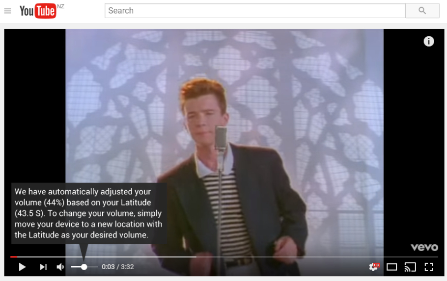
This incredible latitude-based volume control from maharshimartian looks like it’s never gonna’ give you up, or let you down, unless you run around with your laptop.
Not the most intuitive volume control design here from user mienys, but perhaps one for the artists out there. It might take ten minutes to rearrange the dots to enter the desired volume, but there’s certainly a sense of free expression. I wonder what would happen if you drew a dick… Don’t tell me you weren’t thinkin’ it too.
If you’re constantly obsessing over your flaky internet, this Wi-Fi signal strength-based volume control (opens in new tab) from kleinschrader isn’t going to be the one for you. A consistent signal is going to be your friend here, though it could be a useful way to keep tabs on your signal strength if you’re wondering whether you need a Wi-Fi range extender (opens in new tab).
Another gamified volume control here, this time a little more luck-based. User kapeboi has gone with a wheel of fortune (opens in new tab) design which could result in the perfect volume, or perhaps a trip to the ear doctor.
If you’re trying to monitor the temperature in your home, this Arduino and DHT11 temperature sensor volume controller from KapiteinBreinpijn will give you a reading in sound form. That does mean that when it gets a little chilly, you’ll not only be shivering but also straining to hear your music. Sounds like a bad time.
An horrific vision of a capitalist future where only the rich can listen to their music on full volume. I really hope this microtransaction-based volume control (opens in new tab) from SpazJoekp never makes it onto the market.
volume_control_should_be_intuitive from r/ProgrammerHumor
This is another one of our favourites, and we’ve been squawking at our PCs all morning in relation to just how loud we want our volume control to be set. In fact can someone just make this, please?
There are many more in this little rabbit hole of a UI trend. It was a simpler time back then, where joy was more readily found.
Source link

