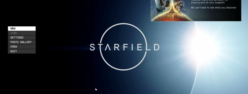
Why people are talking about Starfield’s start screen: Gaming’s latest Twitter dust-up, explained
It’s fair to say that Starfield is Bethesda’s most important game release in years, probably the biggest thing it’s done since rejuvenating the Fallout series back in 2008. And Bethesda head of publishing Pete Hines recently made it clear that the studio is taking the job of bringing that game to life seriously—and that he’ll brook no suggestion that the studio is half-assing any part of it.
Over the weekend, former game developer Mark Kern, whose past credits include StarCraft, World of Warcraft, and Firefall, shared his thoughts on “the physiognomy of start screens.”
“The start screen of a game can reveal a lot about how rushed the team was and how much pride they took in their work,” Kern tweeted. “Starfield’s start screen either shows hasty shipping deadlines by a passionate team overworked, or a team that didn’t care.
“Start screens are often done at the very end of development. Teams are too busy making the core game. It’s quite common for the start screen to completely change once the game is shipping or on patch 0. Teams that take pride want to put a good face forward and will often redo these just prior to game going live.” The comment drew a reported 9.1M impressions on Twitter, including from quote tweets expressing disagreement.
The response from Hines was short and sharp. “[The development team] designed what they wanted and that’s been our menu for years and was one of the first things we settled on,” he tweeted. “Having an opinion is one thing. Questioning out a developer’s ‘care’ because you would have done it differently is highly unprofessional coming from another ‘dev’.”
Hines’ reaction isn’t just notable for its forceful defense of the Starfield team, which is to be expected, but also for its bluntness: Generally accepted rules of social media decorum mean that it’s rare for a high-profile game executive to drop the hammer on someone in such a public fashion.
Hines’ comments were widely supported, and they also sparked some interesting chatter about what makes a “good” start screen, and how developers approach this small-but-symbolic detail.
Gloomwood mastermind Dillon Rogers, for instance, said one of his favorites is from Alien: Isolation, a minimalist scene he said “captures the tone perfectly.”
I don’t think there’s anything wrong with simple main menus.One of my favorites is the menu in Alien Isolation. Captures the tone perfectly with just the right amount of detail. pic.twitter.com/umiHdjfYSsAugust 19, 2023
Half-Life 2, widely regarding as one of the best videogames of all time, takes a similar approach, laying a low-key menu overtop panoramas from the game:
The Last of Us startup screen is just a busted window, and people liked it so much that HBO paid tribute to it in the TV series:
Of course there’s this little thing from a couple years ago you may have heard of:
And we probably shouldn’t forget about this one:
In the end, it all comes down to exactly what Hines said: It’s perfectly valid to not care for a particular example or style of start screen, just as it’s fine to not care for a game genre of any particular sort. But conflating your personal feelings with broad, derogatory statements about developers, as Kern did, takes the conversation from expressions of feeling to assumptions of fact. It’s the sort of “nobody asked” outburst that’s almost purpose-designed to result in the metaphorical throwing of hands—which one Twitter user reminded Hines was probably the whole point.
Starfield is set to launch on September 6. There won’t be playable mechs, but there will be a “snake-worshipping death cult” you can join, if you’re into that sort of thing. I’ve reached out to Bethesda for comment and will update if I receive a reply.
Source link


